
Start with the short answer
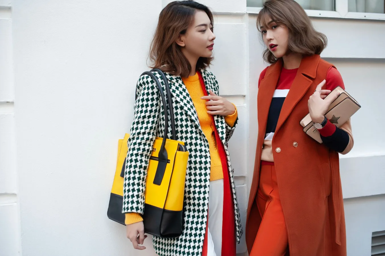
If you are asking what color clothes look best on me, the fastest place to start is your undertone and your overall contrast. People with warm undertones usually look balanced in earthy, golden, and creamy shades. Cool undertones often look best in jewel tones, icy shades, and blue-based colors. Neutral undertones can wear a broader range, while olive skin often needs a little more care because some colors can make it look gray or muddy. best neutral colors for a wardrobe offers more detail on this point. best colour clothes for grey hair offers more detail on this point. colors that flatter warm skin tones offers more detail on this point.
That said, the “best” color is not always the same as the most flattering one. A color can make your skin look brighter, make your features stand out more, or simply feel right for the occasion. The goal of a good color quiz is not to lock you into a narrow palette. It is to help you see which shades work hardest for you and which ones need adjusting with fit, fabric, or styling.
Who this quiz is really for
This kind of quiz is useful if you have ever stood in front of a rack of clothes and felt that one shirt made you look rested while another made you look tired. It is especially helpful if you are building a wardrobe from scratch, trying to shop more intentionally, or tired of buying colors that seem appealing on the hanger but disappoint once you put them on.
It also helps if you are not sure whether your best colors are limited to a strict seasonal palette. Many people are not a perfect textbook example of one category. Lighting, hair color, makeup, and even fabric finish can change how a color reads on your face. A practical quiz should give you a direction, not a rigid rulebook.
How to figure out your best clothing colors
A useful color quiz usually checks four things: undertone, depth, contrast, and saturation. Those terms sound technical, but they are easy to understand once you see what they do.
1. Undertone
Your undertone is the subtle color underneath the surface of your skin. It is not the same as whether you are fair, medium, deep, or tan. Undertone usually falls into warm, cool, or neutral, though many people also notice olive qualities.
- Warm undertones often pair well with cream, camel, olive, rust, coral, mustard, and warm browns.
- Cool undertones often suit navy, cobalt, true red, plum, rose, lavender, and crisp white.
- Neutral undertones can usually wear a wider range, especially colors that are neither strongly warm nor strongly cool.
- Olive undertones can be flattering in muted greens, deep blue-greens, charcoal, and some rich earth tones, but overly yellow or chalky shades may look off.
Undertone is often the biggest clue, but it is not the whole story. Some colors may technically match your undertone and still feel too harsh, too dull, or too flat. That is where contrast and saturation matter.
2. Contrast
Contrast is the difference between your hair, skin, and eyes. High-contrast coloring usually means the features stand apart clearly, such as very dark hair and lighter skin. Low-contrast coloring means the features blend more softly together.
If you have high contrast, you may look more balanced in clothing colors that are equally clear and defined. Deep black, crisp white, vivid jewel tones, and saturated shades can work well. If you have low contrast, softer colors often feel more harmonious: oatmeal, soft navy, dusty rose, sage, and muted teal can look less overpowering.
This is an overlooked point in many color quizzes. A person can have a cool undertone but still look better in a softer version of a cool color rather than a bright, hard-edged one. Contrast changes the finish of the palette, not just the hue.
3. Depth
Depth refers to how light or dark a color appears relative to your features. Some people look best in lighter shades close to their natural coloring. Others need deeper colors to create enough visual support. This is why the same pale blue may look fresh on one person and washed out on another.
If your features are naturally deeper, rich colors such as burgundy, forest green, chocolate, navy, and plum often feel more grounded than very pale pastels. If your features are lighter, softer shades and lighter neutrals may feel easier to wear near the face.
4. Saturation
Saturation is the intensity of a color. Clear, bright colors can look lively, while muted colors look softer and more subdued. Neither is better by default. The right level depends on your natural coloring and the image you want to project.
Bright people often do well in vivid colors. Soft or muted people may look better in colors with a gray, smoky, or dusty quality. This is one reason some shirts look “expensive” on one person and oddly loud on another: the color intensity matches one face better than the other.
A practical way to choose your best colors
If you want a simple quiz-style method, use this sequence while standing in natural light near a mirror.
- Hold up a pure white item and a cream item near your face.
- Compare silver and gold jewelry against your skin.
- Try one bright color and one muted color from the same family.
- Notice whether your face looks clearer, smoother, brighter, or more shadowed.
- Pay attention to the eyes, under-eye area, and overall evenness of the skin tone.
The most useful response is not “I like this color more.” It is “this color seems to make me look more awake” or “this shade brings attention to my face instead of the shirt.” Those are the clues that matter.
Buyer scenarios: what different people should look for
Different shoppers need different answers, and that is where a quiz becomes genuinely helpful.
If you want a work wardrobe
Many people are not looking for the single most dramatic flattering color. They want a dependable palette that works across meetings, commute lighting, and repetitive wear. In that case, choose colors that are easy to layer and that create a polished base: navy, charcoal, soft white, taupe, deep green, muted blue, or blush depending on your undertone.
For workwear, the most practical colors are often the ones that can be repeated without feeling harsh on the face. A flattering shirt color matters, but so does how easily it pairs with trousers, blazers, and outerwear.
If you want outfits that feel brighter
If your clothes feel dull, you may not need a completely different wardrobe. You may just need more saturation or better contrast. A cool-toned person can look more alive in cobalt than in a flat gray-blue. A warm-toned person may need coral or rust rather than beige.
People sometimes mistake “safe” colors for flattering colors. Beige, gray, and black are not automatically the best choices. Depending on your coloring, they can be excellent, decent, or draining.
If you prefer a minimal wardrobe
When your closet is small, your colors need to work harder. Stick to a core palette of neutrals and two or three accent colors that genuinely flatter you. This makes mixing easier and reduces the number of items that feel random or rarely worn.
For minimal wardrobes, it is better to own a few highly compatible shades than a wide set of almost-right colors. A clean, cohesive palette usually beats variety.
Trade-offs worth understanding before you shop
Color analysis can save money and reduce regret, but it also has limits. A flattering color near your face is only one part of how a garment works. Fabric texture, cut, opacity, and finish also matter. A beautiful color in a shiny synthetic fabric may still look less polished than a slightly less perfect color in a better drape.
There is also a trade-off between strict matching and personal expression. Some people feel great in their “best” colors but bored by them. Others prefer to wear a statement color even if it is not their most harmonious shade. That is a valid choice. The point is to know the difference, so you can choose intentionally.
Another constraint is lighting. Store lighting can distort color badly. A top that looks ideal under warm lighting may look different in daylight. If possible, check garments by a window or under neutral light before deciding whether they truly suit you.
Material and finish can change how color looks
The same color can behave very differently depending on the fabric. This is a practical detail that many shoppers overlook.
- Matte fabrics soften a color and can make muted shades more wearable.
- Shiny fabrics intensify color and can make bright shades feel even stronger.
- Textured fabrics often break up color, which can help rich or dark tones feel less heavy.
- Thin, sheer fabrics can affect how a color sits against the skin and what is visible underneath.
If a color almost works but feels a little intense, try it in a different fabric before ruling it out. A soft knit, brushed cotton, or washed finish may be much easier to wear than a slick or glossy version of the same shade.
Common mistakes people make with color quizzes
One common mistake is focusing only on skin tone and ignoring hair and eye contrast. Another is assuming that one flattering color means an entire category will work. For example, liking one green does not mean every green is right for you. Forest green, sage, emerald, and chartreuse can each behave very differently.
People also tend to overvalue black. Black is versatile, but it is not universally flattering. On some people it adds polish. On others it can feel severe or drain warmth from the face. If black does not seem ideal, try deep navy, charcoal, espresso, or soft black instead.
Another misconception is that you must avoid “unflattering” colors completely. Sometimes the fix is placing the color away from the face, layering it with a better shade, or choosing a more flattering version of the same family. A skirt or trouser can be less demanding than a blouse.
Good alternatives if you are still unsure
If you cannot pin yourself to warm or cool, start with versatile shades that are less likely to fight your complexion. Deep navy, soft white, stone, medium denim, muted teal, and charcoal are often easier to manage than very sharp or very pale colors.
Another useful route is to build around one color family that already feels reliable. If blue always works for you, lean into its range: navy, powder blue, slate, cobalt, or teal. If green feels best, test olive, sage, emerald, and pine. This is often more practical than trying to force yourself into an entire palette that feels unnatural.
If you are shopping for a special event, choose the most flattering color in the category you actually need, not the one you think you are supposed to wear. A great dress in the wrong shade still has to compete with your face, your makeup, and the setting.
How to use your results without overcomplicating your wardrobe
Once you have a sense of your best colors, translate that information into a working closet. Start with tops, since they sit closest to your face and have the strongest effect on how your skin looks. Then move to jackets, scarves, dresses, and finally bottoms and shoes.
A simple approach is to divide your closet into three groups:
- Best colors: shades that reliably make you look fresher or more balanced.
- Support colors: shades that work well enough, especially in lower-impact items.
- Questionable colors: shades that only work with careful styling or away from the face.
This makes shopping easier. If a new piece is in a best color, it earns a higher place in your wardrobe. If it is only a support color, make sure it can pair with many other items. If it falls into the questionable group, buy it only if the fit, fabric, and cost all justify it.
Next steps for a better personal color palette
If you want the most useful version of a what color clothes look best on me quiz, use it as a starting point, not a final verdict. Test a few tops in natural light, notice what happens to your face, and pay attention to the shades you actually reach for. Real-life wear tells you more than a theory alone.
From there, build a compact palette around the colors that consistently make you look more awake, more even, or more like yourself. That is the real value of color analysis: fewer mistakes, smarter shopping, and a wardrobe that feels easier to wear.
If you still feel stuck, focus on the lowest-risk choices first. Go with colors that support your undertone, fit your contrast level, and work in the fabrics you wear most. Once those foundations are in place, experimenting with bolder colors becomes much easier.